Mega Hits is a major Portuguese radio station that plays the world’s biggest hits.
The brand struggled to communicate cohesively. They had little design materials and relied on a logo that was difficult to use. We were tasked with creating a visual language that embodied what the brand is and commanded presence.
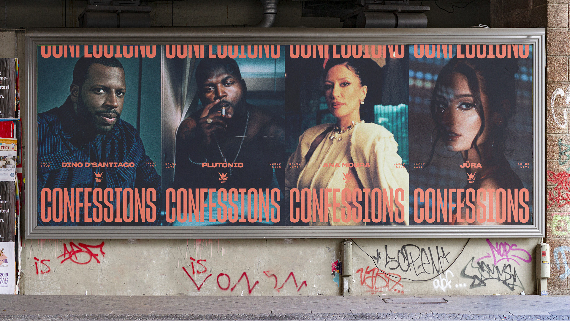
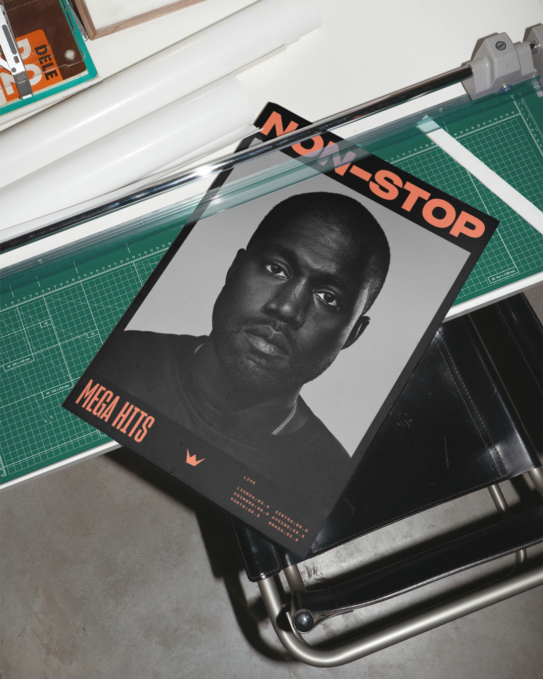
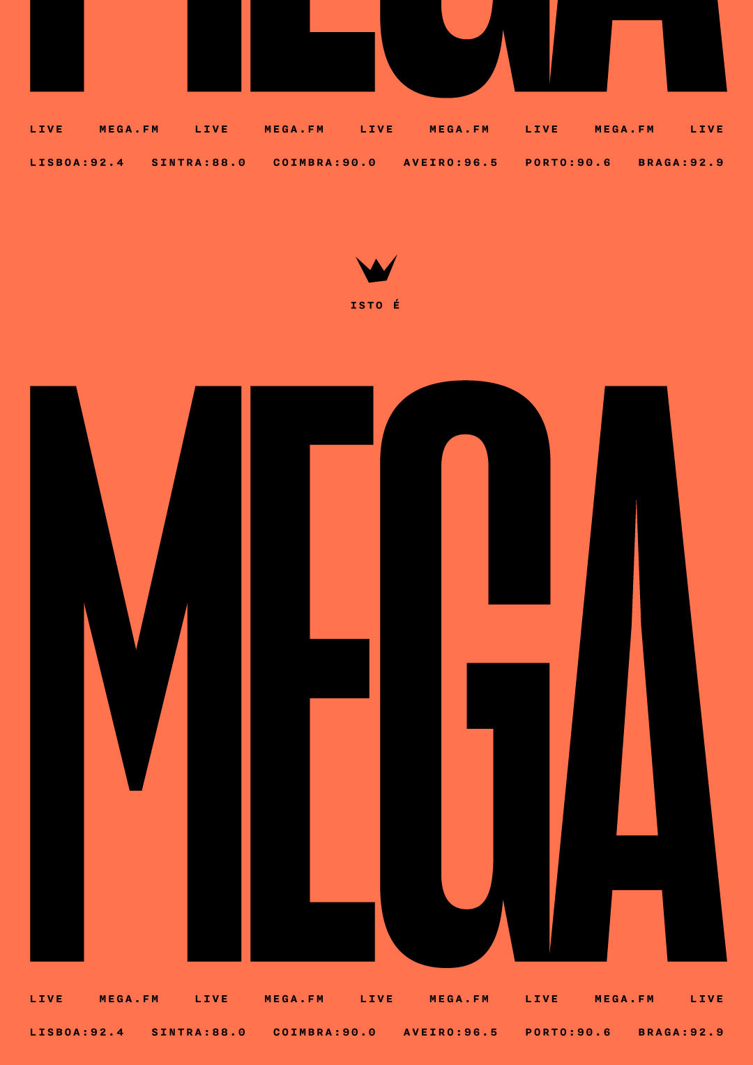
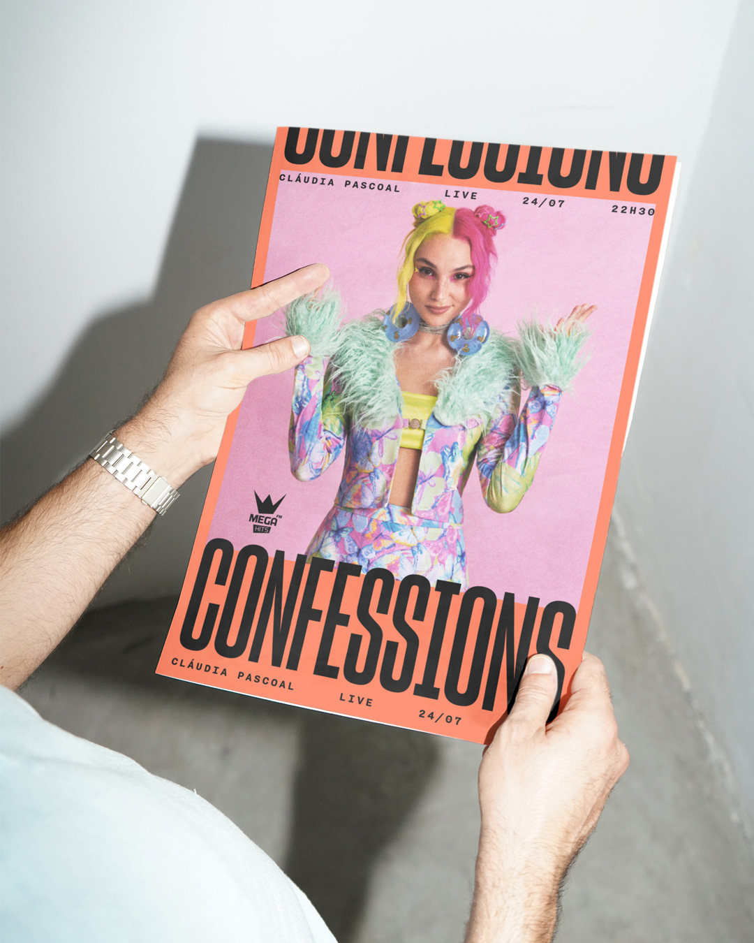
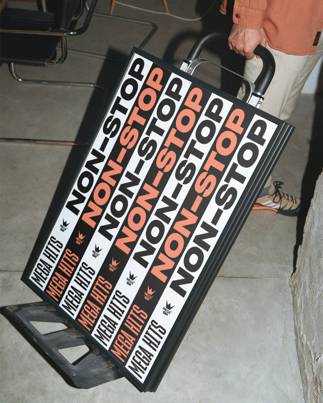
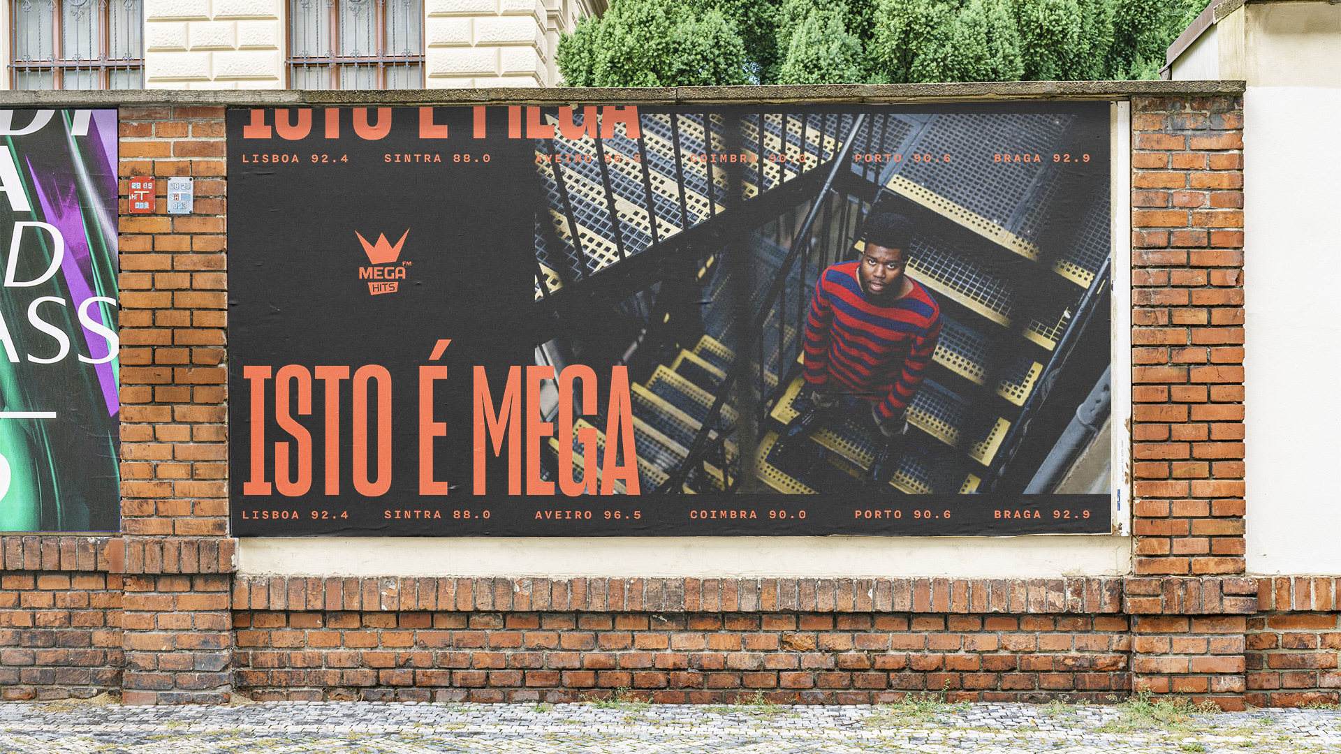
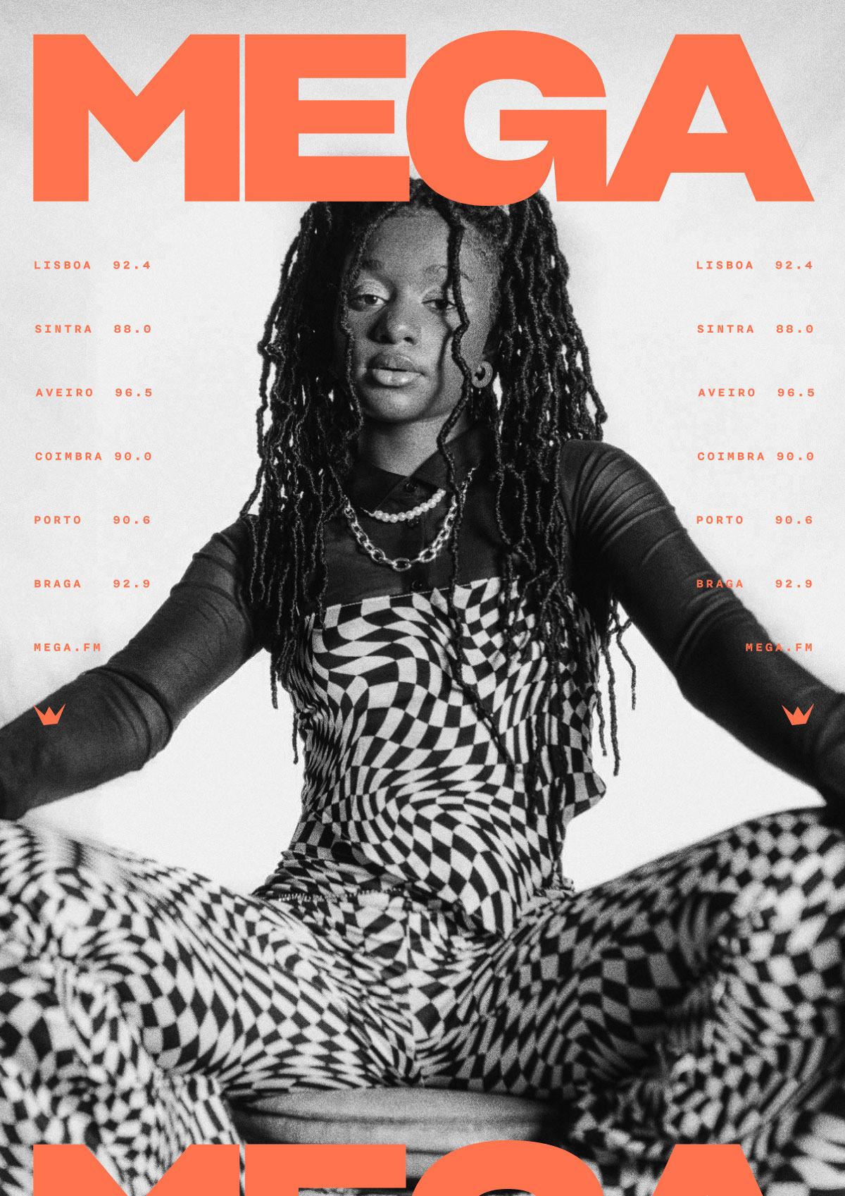
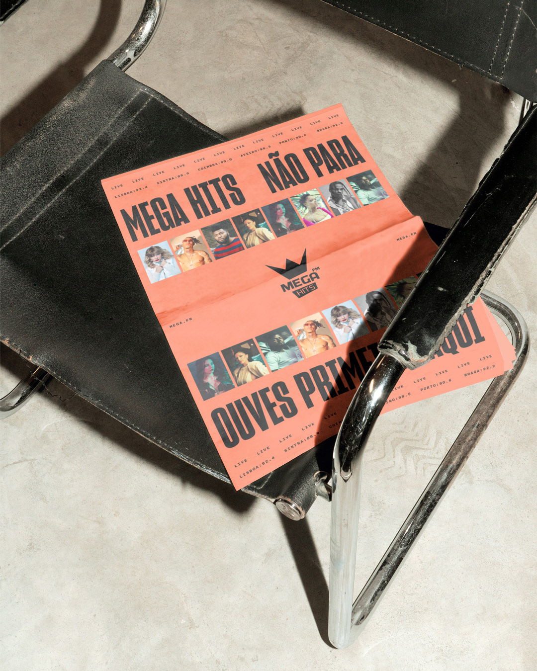
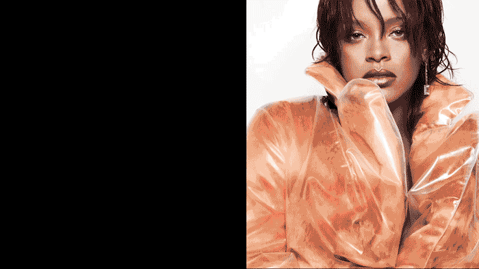
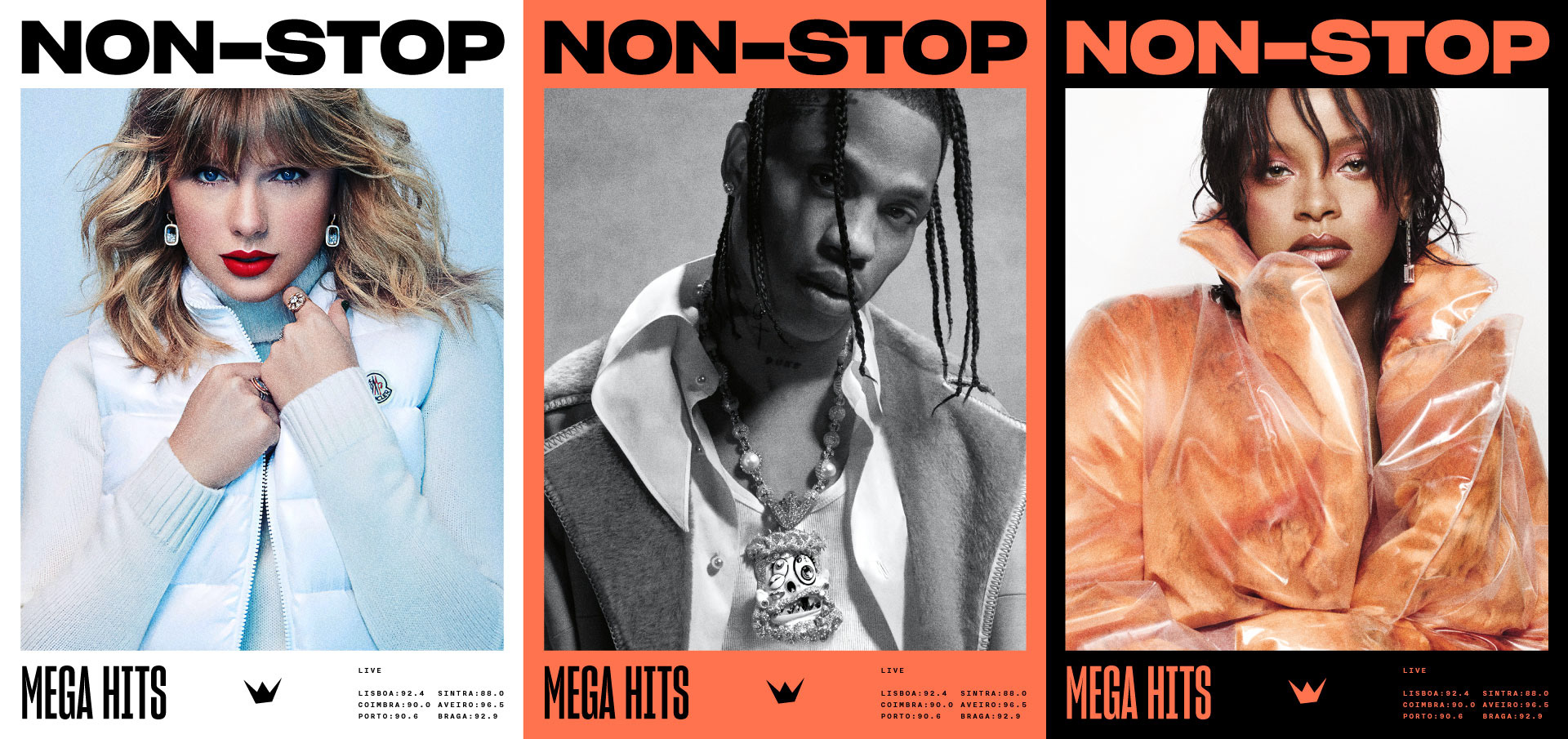
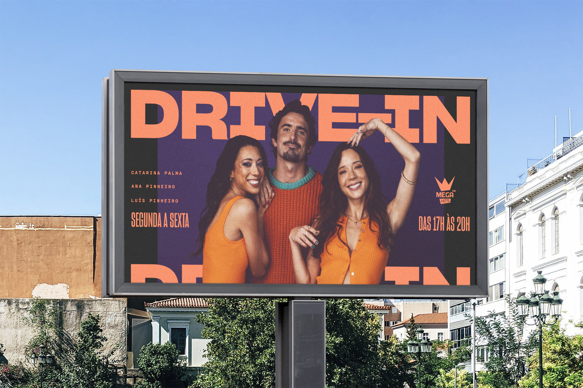
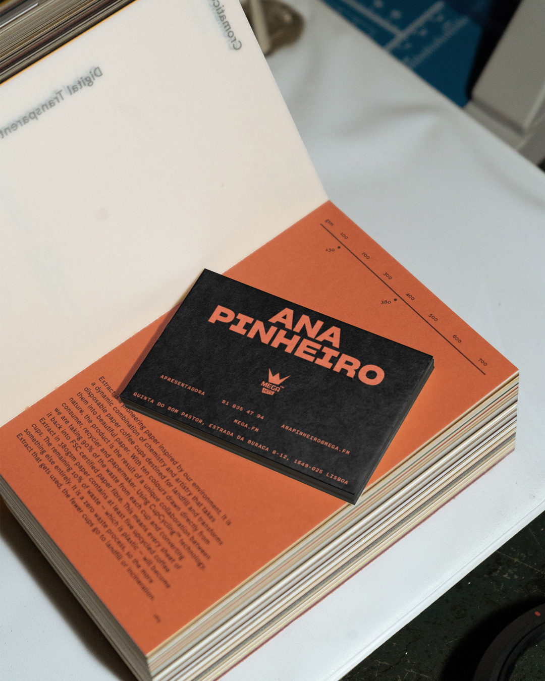
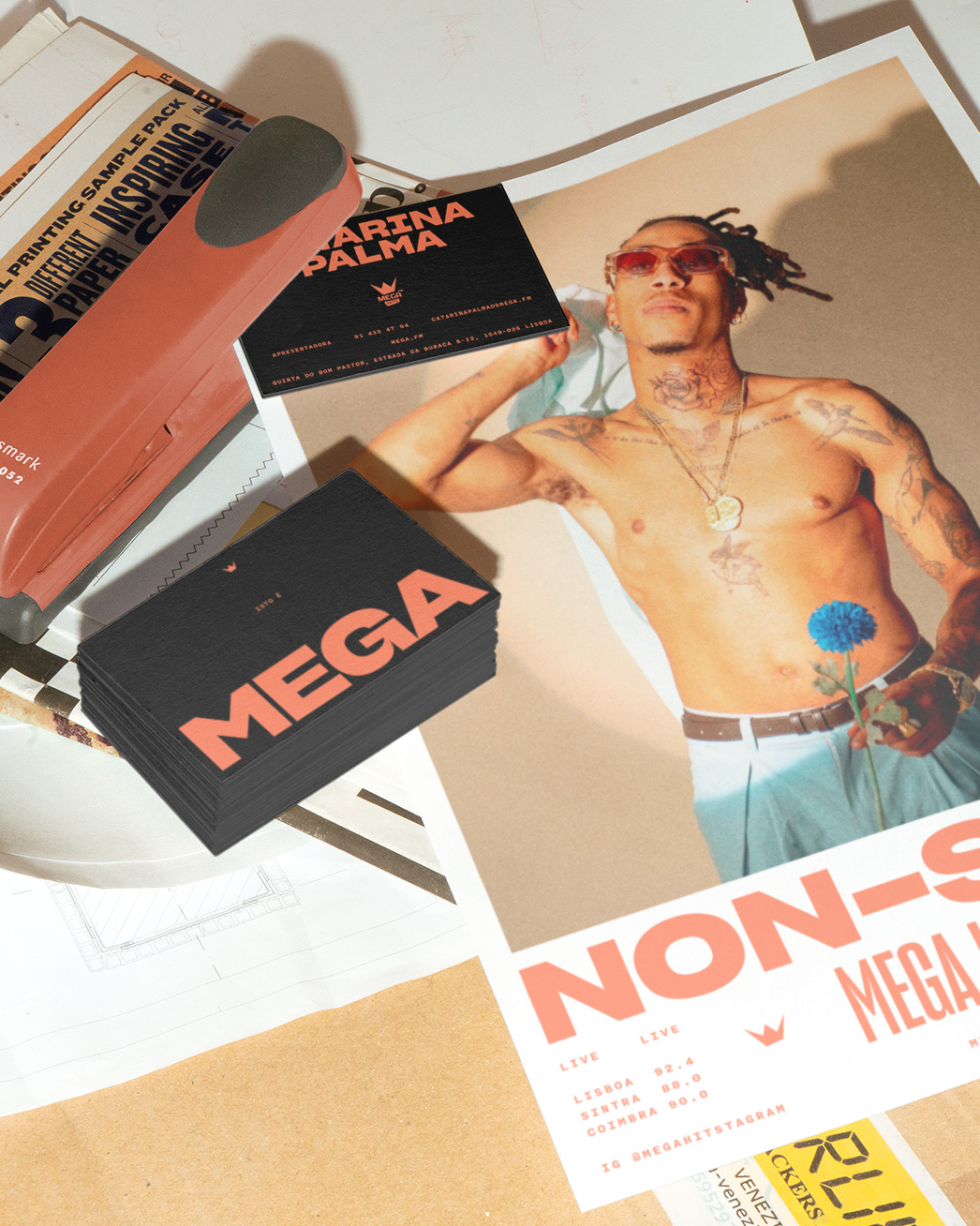
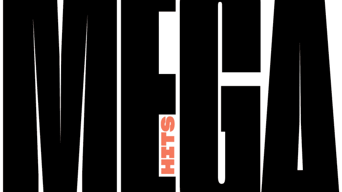
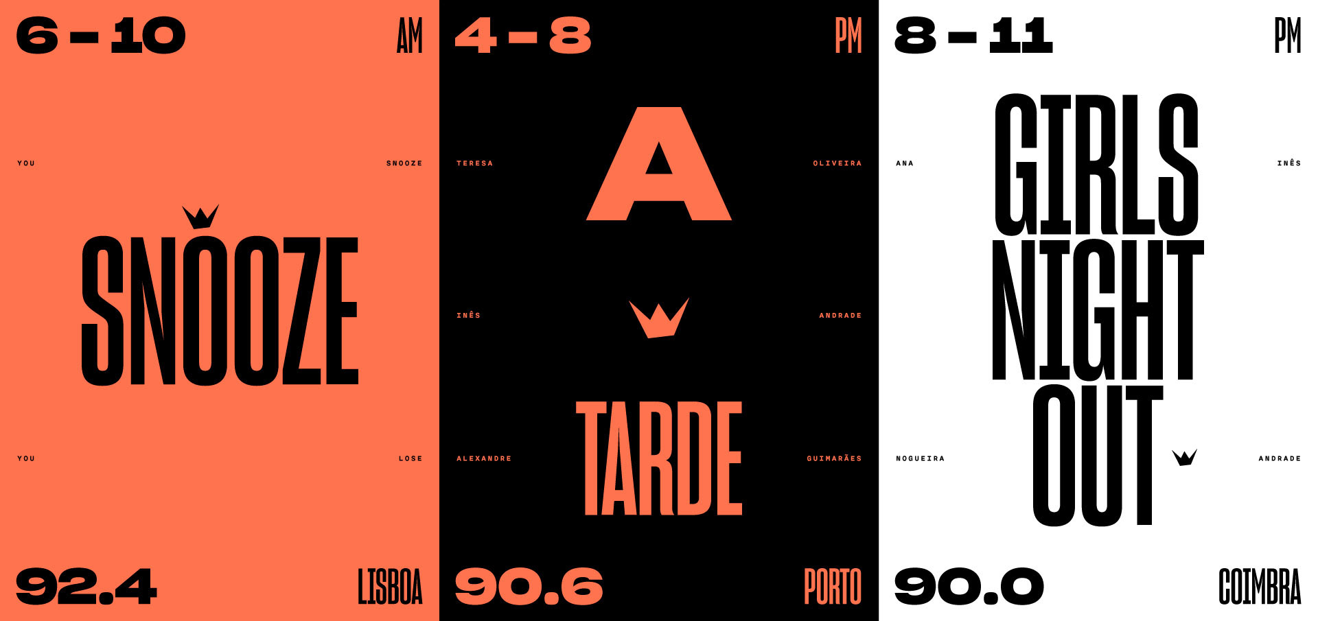
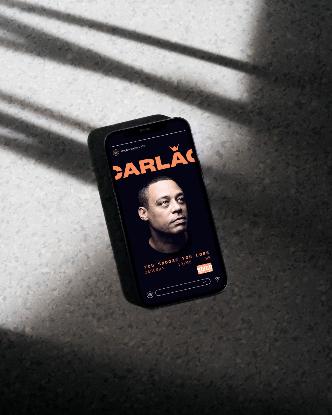
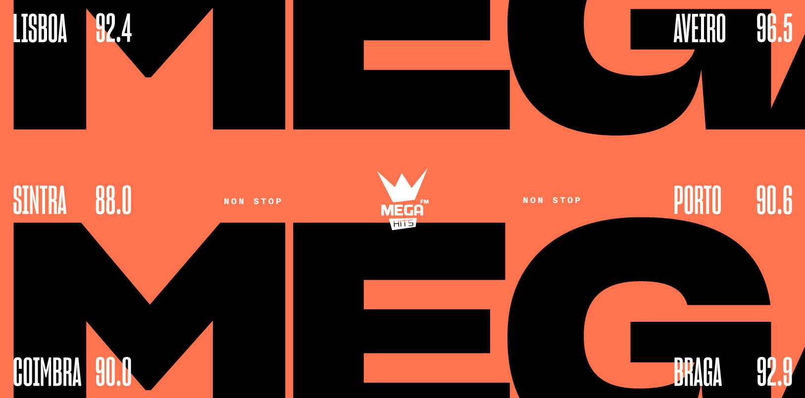
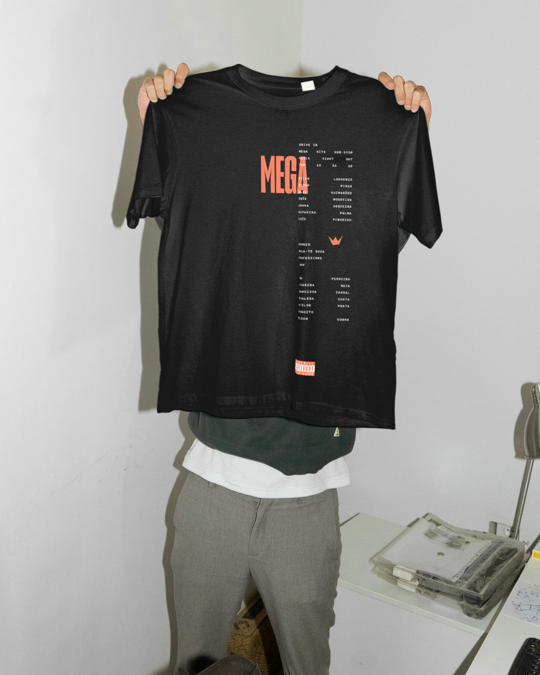
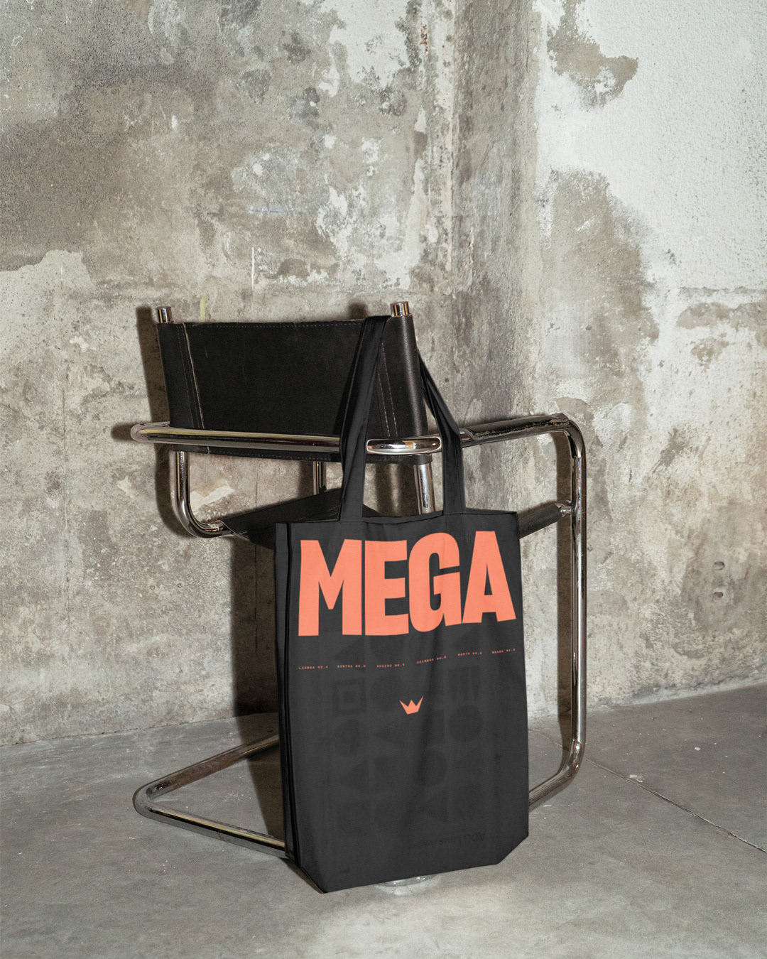
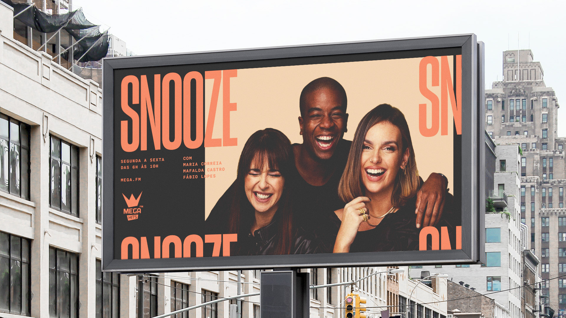
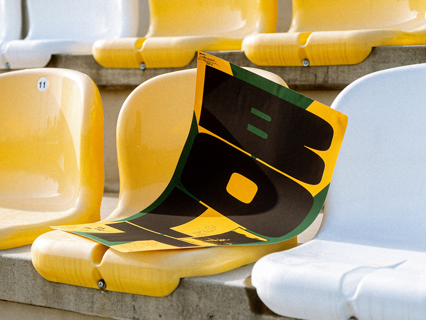
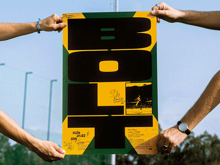
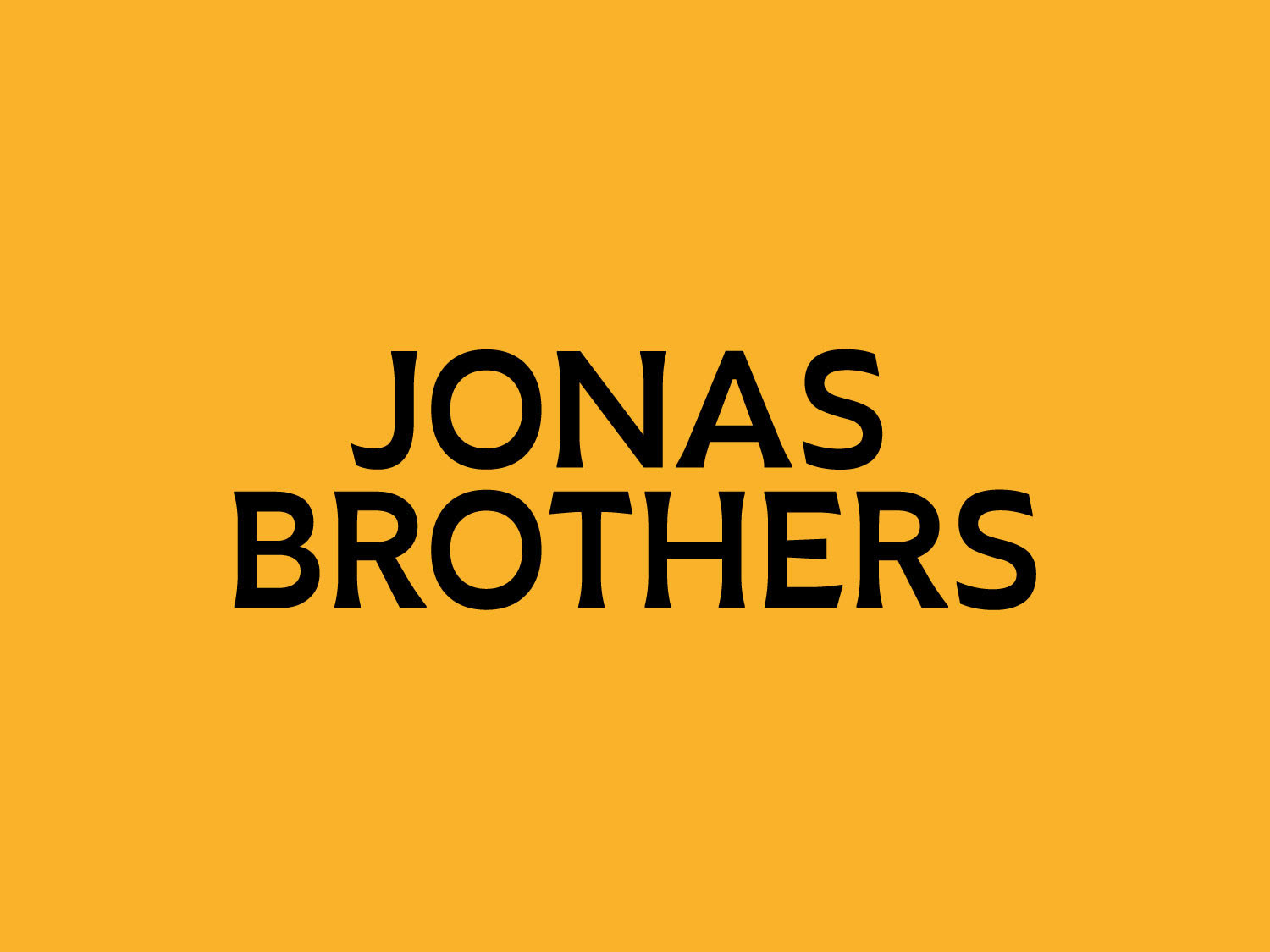
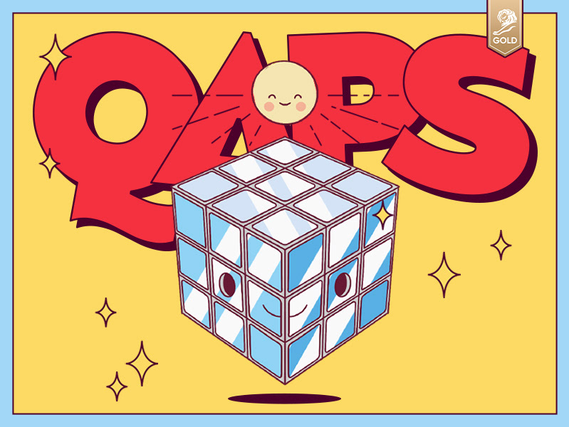
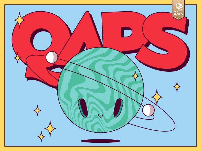
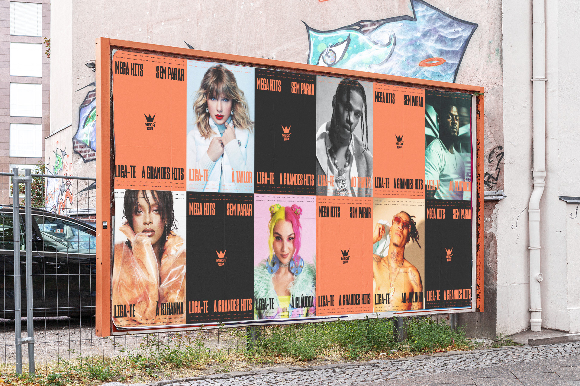
I decided to retain the strongest aspects of the existing brand (the crown, the colours and the Mega name) and use them in a megalomanic attitude, dialling them up for maximum impact.
Client: Radio Renascença / Mega Hits
Agency: NOSSA
Creative Direction: Anne-Laure Chauvin
Design & Art Direction: Seb de la Guardia
Account Managers: David Ramuzat & Maria Cunha
Artworking: Estela Pereira
Animation: André Almeida & Seb de la Guardia
Agency: NOSSA
Creative Direction: Anne-Laure Chauvin
Design & Art Direction: Seb de la Guardia
Account Managers: David Ramuzat & Maria Cunha
Artworking: Estela Pereira
Animation: André Almeida & Seb de la Guardia
Client
▸ Radio Renascença / Mega Hits
Industry
▸ Music / Radio
Focus
▸ Repositioning
▸ Art Direction
▸ Brand Refresh
▸ Brand Collateral
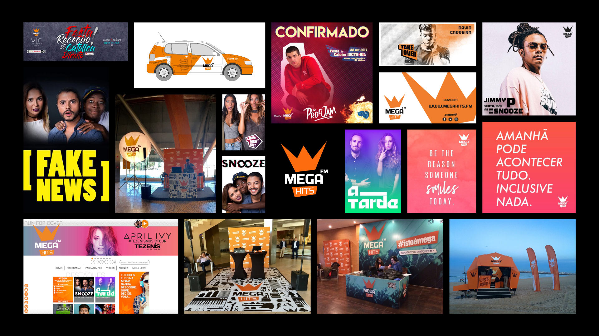
Previous Mega Hits brand materials showing a lack of cohesiveness and distinct identity
The brand needed cohesiveness.
In order to do that we stripped it to its bare minimum: 3 colours, bold typography and a look that's in line with their name.